Flutter Hot Reload Isn't Enough (And Why Flutter Developers Need Widget Previews)
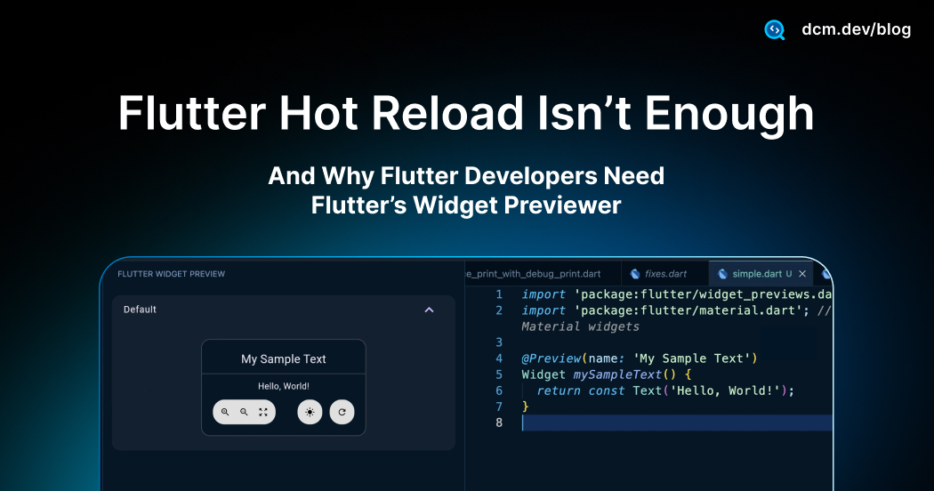
I’ve been developing Flutter apps for years, and Flutter’s evolution never ceases to amaze me. One of the latest game-changers for UI design is the Flutter Widget Previewer, a tool introduced in Flutter 3.35 that lets you see your widgets render in real-time, without running a full app.
If you’ve ever used SwiftUI’s canvas or Jetpack Compose’s previews, this will feel familiar.
The first time I tried Widget Previewer, it clicked that this isn't just about faster hot reloads, it's about isolating UI like a Storybook for Flutter. Rather than navigating the app to see a state, you build previews that live beside your code, with every variation (light/dark, sizes, error states) ready to inspect.
In this post, we’ll explore what the Flutter Widget Previewer is, how to use it, what’s new in Flutter 3.38, and how it can supercharge your UI development, all while noting a few quirks to watch out for.
Let's get started
What the Widget Previewer Actually Is
The Widget Previewer is a tool that isolates your Flutter widgets, rendering them in real-time as you code completely decoupled from your main app UI.
First introduced as an experimental feature in Flutter 3.35, it aims to dramatically accelerate how we build and experiment with UI. To understand the value, you need one mental model:
think of it as a specialized design canvas.
With the Previewer, you instantly visualize a widget (or multiple variations of it) in a dedicated preview area. This means the "noise" of firing up a heavy emulator or navigating five screens deep into your app just to check a pixel adjustment is gone. You get a live render, right next to your code.
Why This Is a Big Deal
Consider the typical "tax" we pay during UI testing. You often need to verify a widget at different screen sizes, with various text scales, in light and dark themes, or across multiple languages.
In the past, this meant rebuilding and running the app repeatedly, toggling device simulators or manually changing settings for each individual scenario. It was tedious and broke your flow.
The Widget Previewer flips that workflow. By using special preview annotations, you can see all these variations side-by-side, almost instantly, without ever restarting the full app.
import 'package:flutter/widget_previews.dart';
import 'package:flutter/material.dart';
(name: 'My Sample Text')
Widget mySampleText() {
return const Text('Hello, World!');
}
In other words, it finally brings a SwiftUI-like rapid feedback loop to Flutter development, letting you iterate on designs faster and with significantly more confidence.
| Without Widget Previewer | With Widget Previewer |
|---|---|
| 1. Save your code | 1. Save your code |
| 2. Hot Reload triggers (instant ✅) | 2. Widget appears instantly in the previewer |
| 3. Tap through splash screen → login screen → form screen | 3. Click the light/dark toggle |
| 4. Change theme to dark mode in settings | 4. Observe the input field in both themes simultaneously |
| 5. Observe the input field | 5. Change the border color |
| 6. Go back, change the border color | 6. Watch it update in real-time |
| 7. Save and repeat steps 1-5 |
Why Hot Reload Alone Falls Short
Hot Reload is great for code-change speed, but it still assumes you navigate your app to see each state. Widget Previewer removes that navigation tax by keeping every variation visible side-by-side (theme, size, text scale, error/helper/disabled). It also lets you DRY up preview definitions via @MultiPreview, so design-system components stay in sync without manual flows.
Enabling the Flutter Widget Previewer
To use the Previewer efficiently, you need Flutter 3.38+. While it technically appeared in 3.35, the IDE integration, which is the whole point of using it arrived in 3.38.
There are three ways to launch it:
- VS Code
- Android Studio / IntelliJ
- Command Line (Manual Mode)
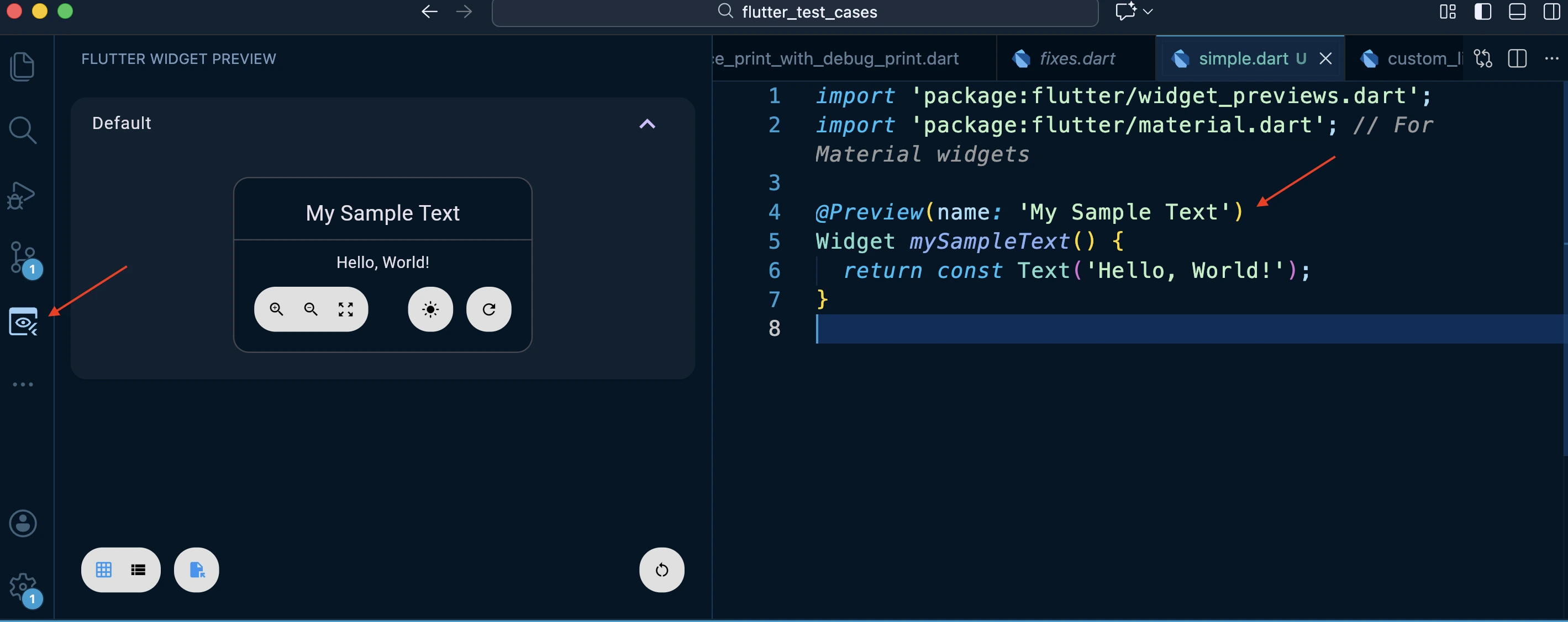
The Previewer integrates directly into your sidebar. Look for the "Flutter Widget Preview" tab in the sidebar (usually on the right). Click it to spin up the environment. It waits for your annotations.
Similar to VS Code, this is a dedicated tool window. Find the "Flutter Widget Preview" tool window. Open the window to initialize the background process.
If you prefer the terminal or want to run it in a standalone Chrome window. Run
flutter widget-preview start
from your project root. This launches a local server and opens the previewer in Chrome. It auto-refreshes on save.
The "Web" Caveat
Under the hood, the previewer uses Dart Development Compiler (DDC) which generates Javascript. The widget previewer supports previews of widgets that have dependencies on dart:io (and soon dart:ffi), but will show an error if APIs from those unsupported libraries are actually invoked. The same goes for widgets that depend Flutter plugins that don't have web support.
How to Create Your First Preview
Once the previewer is running, how do you actually tell it which widgets to display?
This is done with the @Preview annotation. Flutter provides an annotation (@Preview) in the flutter/widget_previews.dart package.
By marking a widget, producing function or constructor with @Preview, you register that widget as a preview entry. The Previewer will detect it and render it for you automatically.
Here are the basic rules and steps to create a preview:
-
Choose a widget to preview. You can use
@Previewon:- A top-level function that returns a Widget (or a WidgetBuilder)
- A static method of a class that returns a Widget.
- A public Widget constructor or factory that has no required parameters (so it can be called without any arguments).
-
Add the
@Previewannotation right above that function/method or class constructor. You can give it a name parameter to label this preview in the UI (otherwise it will use a default name).
Under the Hood: How @Preview Works
The @Preview annotation is implemented as a base class in Flutter's widget_previews.dart. What makes it powerful is its dual nature: it works both as a compile-time annotation and as a runtime configuration object.
When you write @Preview(), you're creating a constant instance of the Preview class. The Flutter tooling analyzes your code at compile time, finds these annotations, and registers the associated functions as preview targets. The annotation itself carries all the configuration data (theme, size, brightness, etc.) that the previewer needs to render your widget correctly.
Here's a simplified view of how it's structured:
base class Preview {
  const Preview({
    String group = 'Default',
    String? name,
    Size? size,
    double? textScaleFactor,
    WidgetWrapper? wrapper,
    PreviewTheme? theme,
    Brightness? brightness,
    PreviewLocalizations? localizations,
  });

  final String group;
  final String? name;
  final Size? size;
  final double? textScaleFactor;
  final WidgetWrapper? wrapper;
  final PreviewTheme? theme;
  final Brightness? brightness;
  final PreviewLocalizations? localizations;

  // Converts this Preview into a mutable builder
  PreviewBuilder toBuilder() => PreviewBuilder._fromPreview(this);

  // Hook for runtime modifications
  Preview transform() => this;
}
Here’s what the "restriction" actually is; in Dart, annotation arguments (anything inside @Preview(...)) must be compile-time constants. That means callback parameters like theme or wrapper can only be a const function tear-off (a top-level function or a static method). You can’t pass an inline closure like (child) => ... or an instance method like someObject.wrap, because those aren’t compile-time constants.
This also has been mentioned in the source code documentation in Flutter repository.
How to Use?
Ensure you import the previewer’s package:
import 'package:flutter/widget_previews.dart';
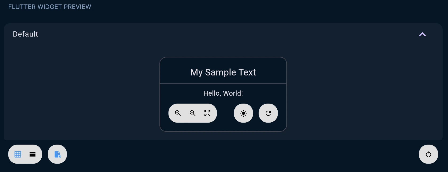
For example, let’s preview a simple Text widget by defining a top-level function:
import 'package:flutter/material.dart';
import 'package:flutter/widget_previews.dart';
(name: 'My Sample Text')
Widget mySampleText() {
return const Text('Hello, World!');
}
In this snippet, we create a function mySampleText that returns a Text widget, and we annotate it with @Preview (naming it "My Sample Text"). The moment you save this file, the Previewer will pick it up.
In your preview panel (or browser), you should now see a card or frame showing “My Sample Text” rendered as Hello, World!.
By default, previews are grouped by file (the Previewer filters to show previews from your currently open file in the IDE). You can turn off filtering to see all previews across the project if needed.
Previewer Controls
Let’s take a closer look at the controls available on a preview card. For any given widget preview, you’ll typically see five round icon buttons:
- Zoom In/Out to magnify or shrink the widget’s view (useful if your widget is small or if you want to inspect details)
- Reset Zoom returns to default scale
- Toggle Light/Dark Mode instantly switch the preview between a light theme and dark theme. This is great for checking theming and contrast.
- Hot Restart (preview) restarts that individual widget’s preview. This applies changes like new state or static initializers without needing to restart the whole preview environment.
- (In the overall preview window, there’s also a global restart button to rebuild everything, useful if something goes awry with state)
Customizing Previews
The @Preview annotation isn’t one-size-fits-all. It comes with several parameters to tailor the preview to your needs.
Here are some of the most useful customization options:
-
name: A label for the preview. This appears as the title above the preview frame (e.g. “My Sample Text” in our earlier example). -
size: Allows you to specify width/height constraints for the previewed widget (using a Size object). This is incredibly handy to simulate different screen sizes or container sizes. For example,@Preview(size: Size(375, 812))might show how a widget looks on an iPhone-sized canvas. If your widget naturally expands to fill its parent, giving it a fixed size in preview ensures it doesn’t just stretch infinitely.(
name: 'iPhone SE Sized',
size: Size(375, 667) // 👈 Constraints the canvas
)
Widget mobileView() => MyResponsiveWidget(); -
brightness: Sets the initial theme brightness (light or dark) for the preview. You can useBrightness.lightorBrightness.dark. This saves you from toggling every time, if you want a specific theme by default. -
theme: You can provide a customPreviewThemeDatavia a function here, which lets you define fullMaterialorCupertinotheme settings for the preview. This is advanced usage, but essentially you could make the preview use your app'sThemeDataby supplying a function that returnsPreviewThemeData(materialLight: myTheme, materialDark: myThemeDark).The
PreviewThemeDataclass is designed to hold separate theme configurations for both Material and Cupertino design systems, each with light and dark variants:base class PreviewThemeData {
const PreviewThemeData({
this.materialLight,
this.materialDark,
this.cupertinoLight,
this.cupertinoDark,
});
final ThemeData? materialLight;
final ThemeData? materialDark;
final CupertinoThemeData? cupertinoLight;
final CupertinoThemeData? cupertinoDark;
// Automatically selects the right theme based on brightness
(ThemeData?, CupertinoThemeData?) themeForBrightness(Brightness brightness) {
if (brightness == Brightness.light) {
return (materialLight, cupertinoLight);
}
return (materialDark, cupertinoDark);
}
}This design makes theme switching seamless, the previewer calls
themeForBrightness()when you toggle light/dark mode. -
wrapper: Perhaps one of the most powerful options. This lets you wrap the previewed widget in another widget. For instance, if your widget relies on an inherited widget (like a theme or localization provided above), you can supply awrapper: (child) => MyAppShell(child: child)to ensure the preview is wrapped with necessary context. This way, even complex widgets that expect certain ancestors can be previewed.The wrapper system is particularly elegant. The
PreviewBuilderclass includes anaddWrapper()method that composes multiple wrappers together:final class PreviewBuilder {
String? group;
String? name;
Size? size;
double? textScaleFactor;
WidgetWrapper? wrapper;
PreviewTheme? theme;
Brightness? brightness;
PreviewLocalizations? localizations;
// Composes wrappers: new wrapper wraps the existing one
void addWrapper(WidgetWrapper newWrapper) {
final existingWrapper = wrapper;
if (existingWrapper != null) {
// Nest them: newWrapper( existingWrapper( widget ) )
wrapper = (Widget widget) => newWrapper(existingWrapper(widget));
} else {
wrapper = newWrapper;
}
}
Preview build() {
return Preview._required(
group: group ?? 'Default',
name: name,
size: size,
textScaleFactor: textScaleFactor,
wrapper: wrapper,
theme: theme,
brightness: brightness,
localizations: localizations,
);
}
}If you call
addWrapper()multiple times, each new wrapper wraps the previous one, creating a nested widget tree. This composition pattern is what enables thetransform()method to dynamically build complex preview configurations at runtime.(
name: 'Input in Context',
wrapper: appWrapper, // 👈 public, allowed in annotation
)
Widget inputPreview() => const MyTextField();
Widget appWrapper(Widget child) {
return Scaffold(
body: Padding(
padding: const EdgeInsets.all(16),
child: child,
),
);
} -
textScaleFactor: Sets the text scale (font size scale) for the preview. Use this to simulate accessibility settings like large text. E.g.textScaleFactor: 2.0will roughly emulate the system being set to 200% font size -
group: A string used to group related previews in the UI. If you have multiple previews that logically belong together (say, several states of the same widget), giving them the same group name will organize them under a collapsible heading in the previewer.(name: 'Normal', group: 'Inputs')
Widget inputNormal() => const TextField();
(name: 'Error', group: 'Inputs')
Widget inputError() => const TextField(decoration: InputDecoration(errorText: 'Fail'));
Using these parameters, you can cover a wide range of scenarios.
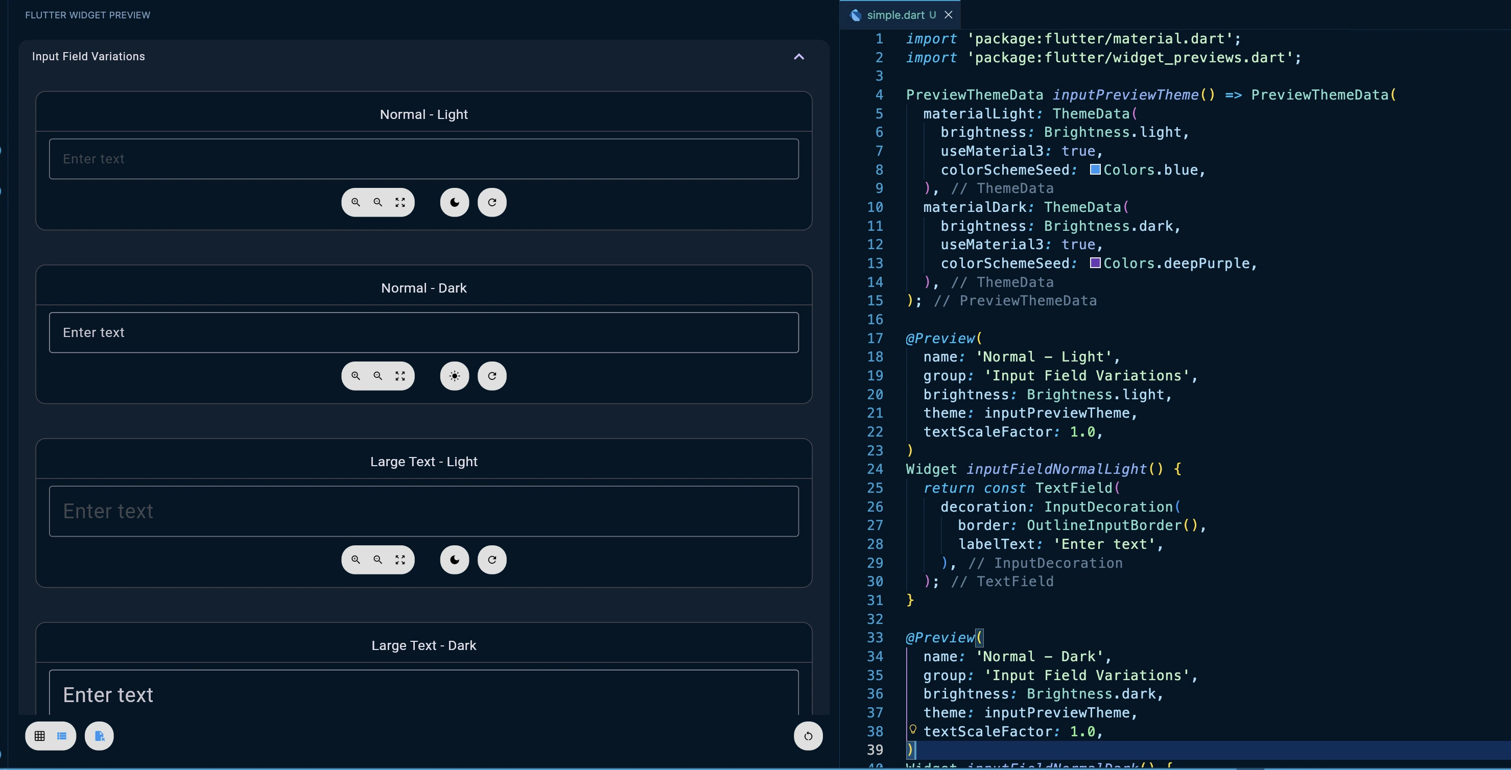
Here's a practical example showing an input field tested across different sizes and text scales:
import 'package:flutter/material.dart';
import 'package:flutter/widget_previews.dart';
PreviewThemeData inputPreviewTheme() => PreviewThemeData(
materialLight: ThemeData(
brightness: Brightness.light,
useMaterial3: true,
colorSchemeSeed: Colors.blue,
),
materialDark: ThemeData(
brightness: Brightness.dark,
useMaterial3: true,
colorSchemeSeed: Colors.deepPurple,
),
);
(
name: 'Normal - Light',
group: 'Input Field Variations',
brightness: Brightness.light,
theme: inputPreviewTheme,
textScaleFactor: 1.0,
)
Widget inputFieldNormalLight() {
return const TextField(
decoration: InputDecoration(
border: OutlineInputBorder(),
labelText: 'Enter text',
),
);
}
(
name: 'Normal - Dark',
group: 'Input Field Variations',
brightness: Brightness.dark,
theme: inputPreviewTheme,
textScaleFactor: 1.0,
)
Widget inputFieldNormalDark() {
return const TextField(
decoration: InputDecoration(
border: OutlineInputBorder(),
labelText: 'Enter text',
),
);
}
(
name: 'Large Text - Light',
group: 'Input Field Variations',
brightness: Brightness.light,
theme: inputPreviewTheme,
textScaleFactor: 1.5,
)
Widget inputFieldLargeTextLight() {
return const TextField(
decoration: InputDecoration(
border: OutlineInputBorder(),
labelText: 'Enter text',
),
);
}
(
name: 'Large Text - Dark',
group: 'Input Field Variations',
brightness: Brightness.dark,
theme: inputPreviewTheme,
textScaleFactor: 1.5,
)
Widget inputFieldLargeTextDark() {
return const TextField(
decoration: InputDecoration(
border: OutlineInputBorder(),
labelText: 'Enter text',
),
);
}
All four variations appear grouped together. You can compare them side-by-side without manually changing settings between observations. This is the opposite of navigating through your app manually.
The Wrapper Parameter (Crucial for Injecting State and Context)
Most real-world widgets depend on context—theme data, inherited state, providers, localization. This is where the wrapper parameter becomes essential:
Without a proper context, many widgets simply won't render correctly. The wrapper parameter lets you inject your widget into a complete widget tree:
import 'package:flutter/material.dart';
import 'package:flutter/widget_previews.dart';
(
name: 'Input in Form Context',
wrapper: formContextWrapper,
)
Widget inputInFormPreview() {
return const TextField(
decoration: InputDecoration(
border: OutlineInputBorder(),
labelText: 'Username',
helperText: 'Enter your username',
),
);
}
// Wrapper: no MaterialApp, just form-like context around the field.
Widget formContextWrapper(Widget child) {
return Scaffold(
appBar: AppBar(title: const Text('Form Example')),
body: SingleChildScrollView(
child: Padding(
padding: const EdgeInsets.all(16),
child: child,
),
),
);
}
Now your input field renders with proper Material context, AppBar, Scaffold, and padding, everything you need to see how it actually looks in your app, but without navigating through your app.
Multiple Previews Reveal Hidden Edge Cases
Here's a powerful pattern: create multiple preview configurations for different widget states. This is where Widget Previewer reveals bugs that manual testing might miss:
import 'package:flutter/material.dart';
import 'package:flutter/widget_previews.dart';
(name: 'Empty State', group: 'Input States', wrapper: inputStateWrapper)
Widget inputEmptyStatePreview() {
return const TextField(
decoration: InputDecoration(
border: OutlineInputBorder(),
labelText: 'Username',
),
);
}
(name: 'With Value', group: 'Input States', wrapper: inputStateWrapper)
Widget inputWithValuePreview() {
// Simple controller just for the preview.
final controller = TextEditingController(text: 'dcm.dev');
return TextField(
controller: controller,
decoration: const InputDecoration(
border: OutlineInputBorder(),
labelText: 'Username',
),
);
}
(name: 'Error State', group: 'Input States', wrapper: inputStateWrapper)
Widget inputErrorStatePreview() {
return const TextField(
decoration: InputDecoration(
border: OutlineInputBorder(),
labelText: 'Username',
errorText: 'Required',
),
);
}
(
name: 'Disabled State',
group: 'Input States',
wrapper: inputStateWrapper,
)
Widget inputDisabledStatePreview() {
return const TextField(
enabled: false,
decoration: InputDecoration(
border: OutlineInputBorder(),
labelText: 'Username',
),
);
}
// Small neutral wrapper: keeps things compact and centered.
Widget inputStateWrapper(Widget child) {
return Center(
child: Padding(
padding: const EdgeInsets.all(16),
child: ConstrainedBox(
constraints: const BoxConstraints(maxWidth: 320),
child: child,
),
),
);
}
This highlights a limitation: "a single preview function can't return different widgets for each preview".
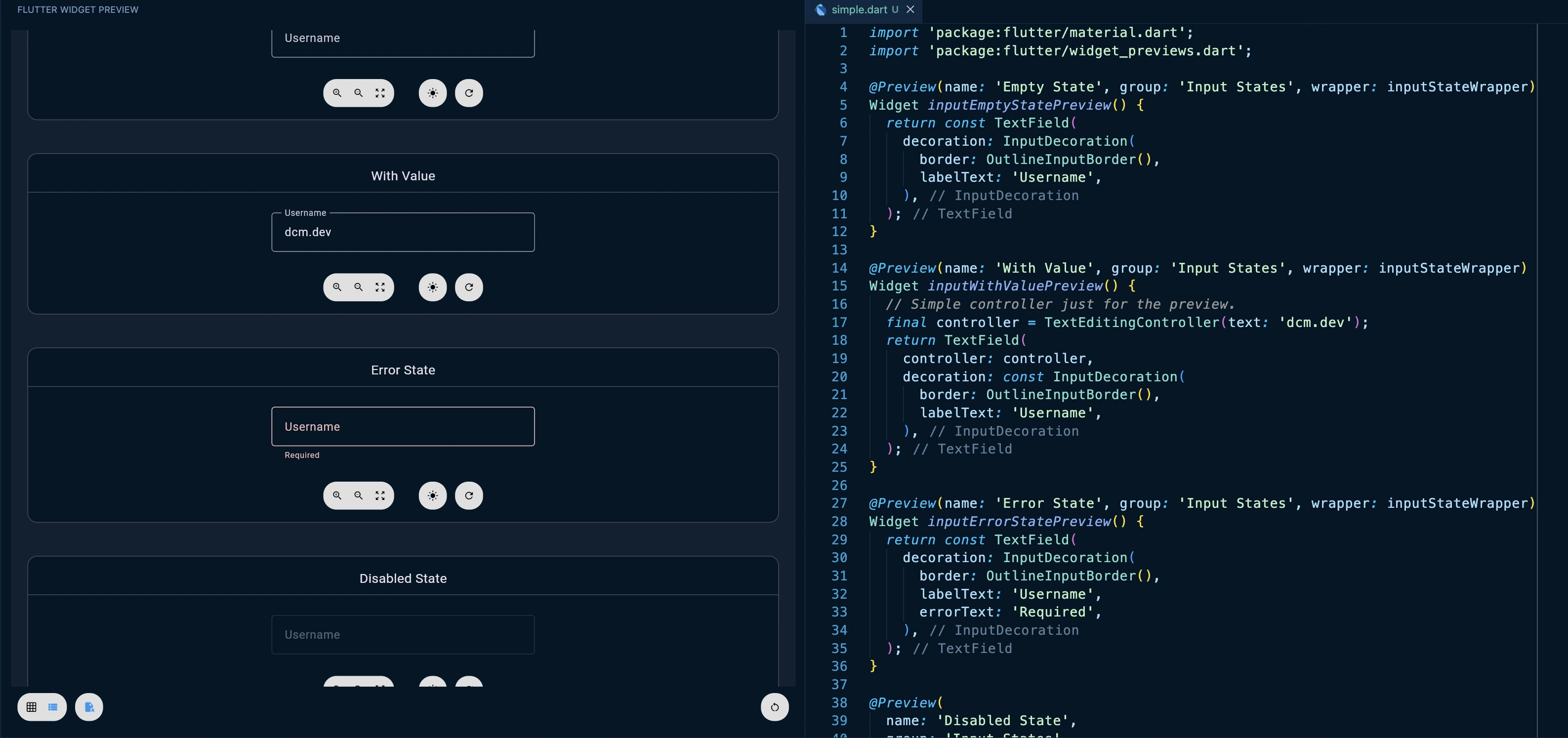
This is where @MultiPreview becomes essential.
Custom Preview Annotations for DRY Code
Flutter 3.38 made the Preview class extendable. This lets you create custom preview annotations that eliminate boilerplate:
Understanding MultiPreview and transform()
The MultiPreview abstract base class is designed to generate multiple Preview instances from a single annotation:
abstract base class MultiPreview {
  const MultiPreview();

  // Your subclass provides this: a const list of Preview configurations
  List<Preview> get previews;

  // Runtime hook: transform each preview before it's used
  List<Preview> transform() {
    return previews.map((preview) => preview.transform()).toList();
  }
}
You extend it and provide a list of Preview objects via the previews getter. The real magic happens in the transform() method. While the annotation itself must be constant, transform() runs at runtime, giving you the ability to modify previews programmatically:
final class MyCustomPreview extends MultiPreview {
const MyCustomPreview({required this.baseName});
final String baseName;
List<Preview> get previews => const [
Preview(brightness: Brightness.light),
Preview(brightness: Brightness.dark),
];
List<Preview> transform() {
final basePreviews = super.transform();
return basePreviews.asMap().entries.map((entry) {
final index = entry.key;
final preview = entry.value;
// Convert to mutable builder
final builder = preview.toBuilder();
// Modify at runtime (not possible in const context)
builder.name = '$baseName - ${index == 0 ? "Light" : "Dark"}';
builder.group = 'Custom Group';
builder.addWrapper((child) => Padding(
padding: const EdgeInsets.all(16),
child: child,
));
// Build the modified preview
return builder.build();
}).toList();
}
}
Each Preview has a toBuilder() method that converts it into a mutable PreviewBuilder, where you can change any property, add wrappers, or even compose complex configurations that wouldn't be possible in a const context.
This two-phase approach, constant annotation followed by runtime transformation, is what makes custom preview annotations so powerful. You define the structure at compile time, then enhance it with dynamic behavior at runtime.
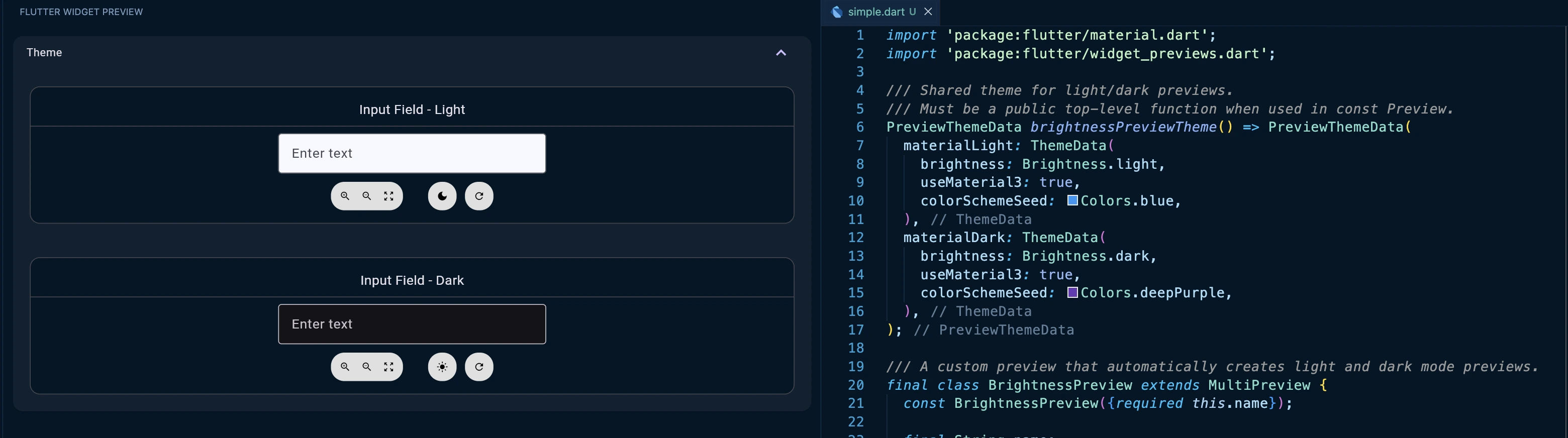
import 'package:flutter/material.dart';
import 'package:flutter/widget_previews.dart';
/// Shared theme for light/dark previews.
/// Must be a public top-level function when used in const Preview.
PreviewThemeData brightnessPreviewTheme() => PreviewThemeData(
materialLight: ThemeData(
brightness: Brightness.light,
useMaterial3: true,
colorSchemeSeed: Colors.blue,
),
materialDark: ThemeData(
brightness: Brightness.dark,
useMaterial3: true,
colorSchemeSeed: Colors.deepPurple,
),
);
/// A custom preview that automatically creates light and dark mode previews.
final class BrightnessPreview extends MultiPreview {
const BrightnessPreview({required this.name});
final String name;
List<Preview> get previews => const [
Preview(
brightness: Brightness.light,
theme: brightnessPreviewTheme,
group: 'Theme',
),
Preview(
brightness: Brightness.dark,
theme: brightnessPreviewTheme,
group: 'Theme',
),
];
List<Preview> transform() {
final base = super.transform();
final lightBuilder = base[0].toBuilder()..name = '$name - Light';
final darkBuilder = base[1].toBuilder()..name = '$name - Dark';
return [lightBuilder.build(), darkBuilder.build()];
}
}
// Usage – no repetition needed.
(name: 'Input Field')
Widget inputFieldPreview() {
return Builder(
builder: (context) {
final scheme = Theme.of(context).colorScheme;
return Center(
child: ConstrainedBox(
constraints: const BoxConstraints(maxWidth: 320),
child: TextField(
decoration: InputDecoration(
filled: true,
fillColor: scheme.surface,
border: const OutlineInputBorder(),
labelText: 'Enter text',
),
),
),
);
},
);
}
Instead of writing light/dark previews manually every time, you define the pattern once and reuse it everywhere. For teams building design systems, this is game-changing.
And here's the advanced move: Preview has a transform() method that lets you modify previews at runtime, enabling things impossible in a const context:
import 'package:flutter/material.dart';
import 'package:flutter/widget_previews.dart';
final class AccessibilityPreview extends MultiPreview {
const AccessibilityPreview();
List<Preview> get previews => const [
Preview(name: 'Normal'),
Preview(name: 'Large Text', textScaleFactor: 1.5),
Preview(name: 'Extra Large Text', textScaleFactor: 2.0),
];
List<Preview> transform() {
final previews = super.transform();
return previews.map((preview) {
final builder = preview.toBuilder();
builder.group = 'Accessibility';
return builder.build();
}).toList();
}
}
()
Widget accessibleInputPreview() {
return const TextField(
decoration: InputDecoration(
border: OutlineInputBorder(),
labelText: 'Username',
),
);
}
A Design System Input Component
Let's tie this together. Imagine you're maintaining a design system with a custom input component. This pattern keeps every state of the component previewable in one place so they stay in sync as you evolve the design.
import 'package:flutter/material.dart';
import 'package:flutter/widget_previews.dart';
class DesignSystemInput extends StatelessWidget {
final String label;
final String? errorText;
final bool enabled;
final String? helperText;
const DesignSystemInput({
super.key,
required this.label,
this.errorText,
this.enabled = true,
this.helperText,
});
Widget build(BuildContext context) {
return TextField(
enabled: enabled,
decoration: InputDecoration(
border: const OutlineInputBorder(),
labelText: label,
errorText: errorText,
helperText: helperText,
),
);
}
}
/// Shared theme for all previews in this MultiPreview.
/// NOTE: must be a top-level *public* function because it's used in annotations.
PreviewThemeData designSystemPreviewTheme() => PreviewThemeData(
materialLight: ThemeData(
brightness: Brightness.light,
useMaterial3: true,
colorSchemeSeed: Colors.blue,
),
materialDark: ThemeData(
brightness: Brightness.dark,
useMaterial3: true,
colorSchemeSeed: Colors.deepPurple,
),
);
// Define custom preview annotation for consistency
final class DesignSystemInputPreview extends MultiPreview {
const DesignSystemInputPreview();
List<Preview> get previews => const [
Preview(
name: 'Default - Light',
brightness: Brightness.light,
group: 'States',
theme: designSystemPreviewTheme,
),
Preview(
name: 'Default - Dark',
brightness: Brightness.dark,
group: 'States',
theme: designSystemPreviewTheme,
),
Preview(
name: 'With Helper - Light',
brightness: Brightness.light,
group: 'States',
theme: designSystemPreviewTheme,
),
Preview(
name: 'With Helper - Dark',
brightness: Brightness.dark,
group: 'States',
theme: designSystemPreviewTheme,
),
Preview(
name: 'Error - Light',
brightness: Brightness.light,
group: 'States',
theme: designSystemPreviewTheme,
),
Preview(
name: 'Error - Dark',
brightness: Brightness.dark,
group: 'States',
theme: designSystemPreviewTheme,
),
Preview(
name: 'Disabled - Light',
brightness: Brightness.light,
group: 'States',
theme: designSystemPreviewTheme,
),
Preview(
name: 'Disabled - Dark',
brightness: Brightness.dark,
group: 'States',
theme: designSystemPreviewTheme,
),
];
List<Preview> transform() {
final previews = super.transform();
return previews.map((preview) {
final builder = preview.toBuilder();
final name = preview.name ?? '';
if (name.contains('Helper')) {
builder.wrapper = _helperWrapper;
} else if (name.contains('Error')) {
builder.wrapper = _errorWrapper;
} else if (name.contains('Disabled')) {
builder.wrapper = _disabledWrapper;
} else {
builder.wrapper = _defaultWrapper;
}
return builder.build();
}).toList();
}
}
// Wrapper functions for different states
Widget _defaultWrapper(Widget child) {
// Previewer supplies MaterialApp + theme; we just add layout.
return Scaffold(
body: Padding(padding: const EdgeInsets.all(16), child: child),
);
}
Widget _helperWrapper(Widget child) {
return const Scaffold(
body: Padding(
padding: EdgeInsets.all(16),
child: DesignSystemInput(
label: 'Email',
helperText: 'Enter your email address',
),
),
);
}
Widget _errorWrapper(Widget child) {
return const Scaffold(
body: Padding(
padding: EdgeInsets.all(16),
child: DesignSystemInput(
label: 'Email',
errorText: 'Invalid email format',
),
),
);
}
Widget _disabledWrapper(Widget child) {
return const Scaffold(
body: Padding(
padding: EdgeInsets.all(16),
child: DesignSystemInput(label: 'Email', enabled: false),
),
);
}
// The preview
()
Widget designSystemInputPreview() {
// Used by "Default" variants; other states override via wrapper.
return const DesignSystemInput(label: 'Email Address');
}
Now, whenever you modify the DesignSystemInput component, all eight variations render instantly in the previewer. You see every combination of state and theme without manually navigating your app.
You change the widget once and instantly see every variant in light/dark and across error/helper/disabled states.
This is what eliminates the "navigation friction" problem. You're not testing components anymore; you're validating them systematically.
My Rules for Widget Previewer Success
Based on real-world usage (and the constraints baked into widget_previews.dart: static/public callbacks for const annotations, default group of "Default", wrappers composing at runtime), here are the rules that will make your life easier:
✅ DO preview any widget that doesn't require constructor arguments. Top-level functions, static methods, and parameterless constructors are perfect.
✅ DO use the wrapper parameter to inject MaterialApp, Scaffold, theme context, or any dependency your widget needs. Keep wrapper callbacks public/static so they can be referenced from const annotations.
✅ DO create custom preview annotations (extends Preview or extends MultiPreview) when you have repeating preview patterns. This keeps your codebase DRY and maintainable.
✅ DO use group to organize related previews. This makes the previewer UI manageable as your component library grows.
✅ DO test accessibility variations with textScaleFactor. This catches responsive design issues early.
⛔️ DON'T expect to preview widgets with required constructor arguments without wrapper setup.
⛔️ DON'T use relative asset paths. Always use package-based paths like 'packages/my_package/assets/image.png'.
⛔️ DON'T rely on dart:io or dart:ffi APIs in previewed widgets, they won't work in the web-based previewer. Use conditional imports if your widget has platform-specific code.
⛔️ DON'T preview widgets tightly coupled to native platform features (camera, sensors, file system). These simply won't render in the web environment.
From Preview to Maintainable Widgets
Widget Previewer solves the visibility problem you see every state instantly. But as your component library grows, a new problem emerges: widget maintainability and quality.
You end up with 20 similar buttons, 15 card variants, and 8 input fields that are almost identical. Some widgets become 300-line monsters with cyclomatic complexity through the roof. Others get copy-pasted across files because it's faster than refactoring. Your design system fragments.
This is where DCM's analyze-widgets command becomes essential. It's a static analysis tool specifically built for Flutter's widget layer that answers questions you can't answer with previews alone:
- Is this widget too complex? DCM calculates quality scores based on code metrics (cyclomatic complexity, lines of code, nesting depth, etc.), flagging widgets that have grown too large or tangled.
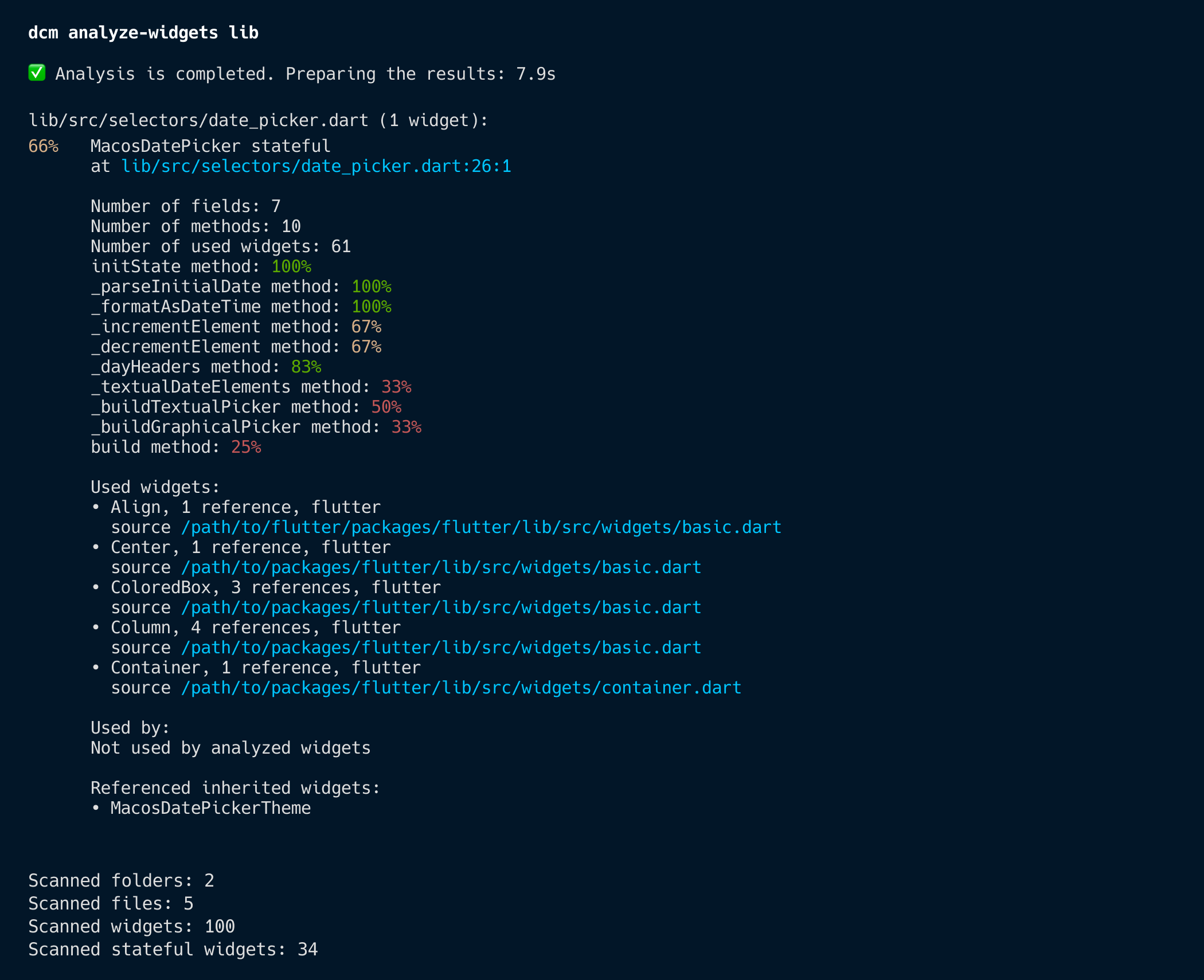
- Where is this widget used? It reports widget usage across your codebase, helping you understand the blast radius of changes.
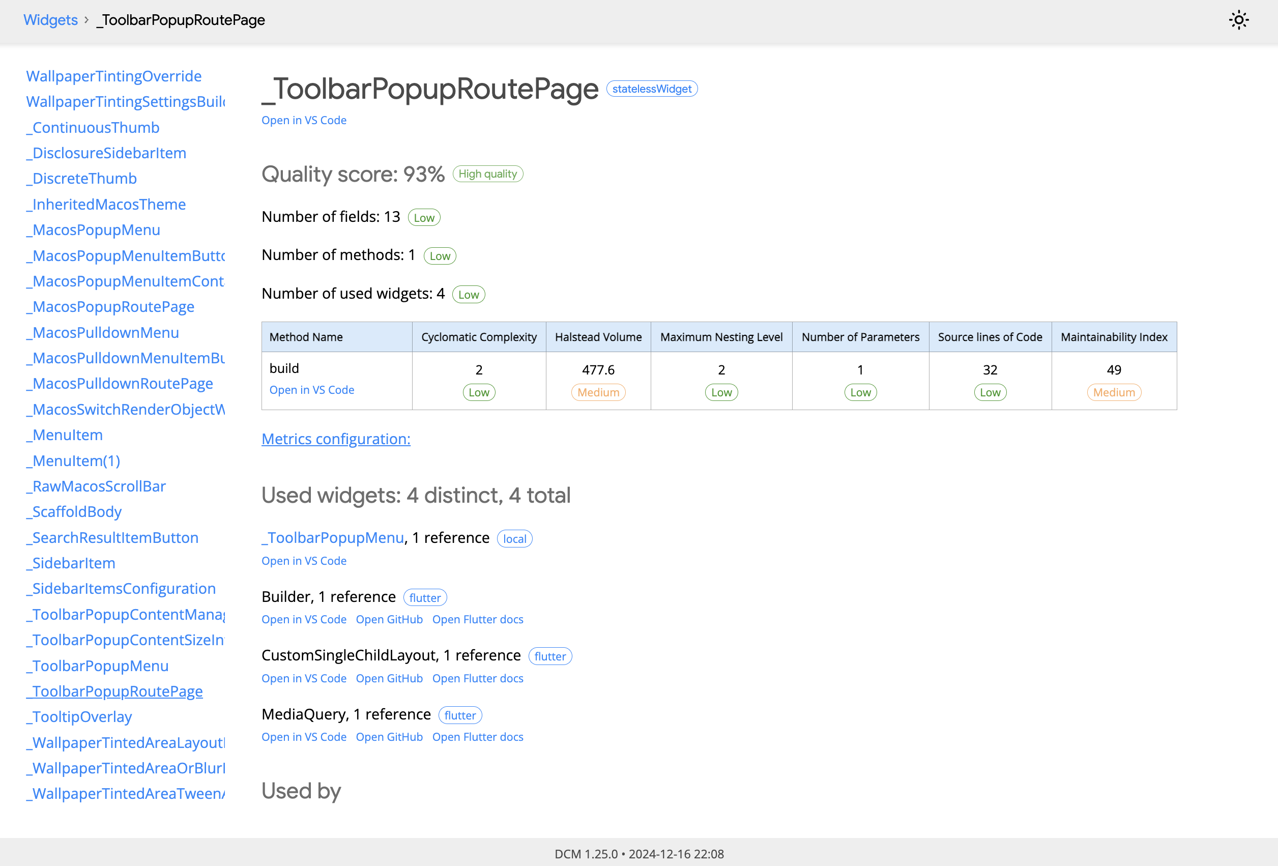
- Do I have duplicate widgets? With
--show-similarity, it detects near-identical widget subtrees, those copy/paste jobs that should've been extracted into shared components (perhaps)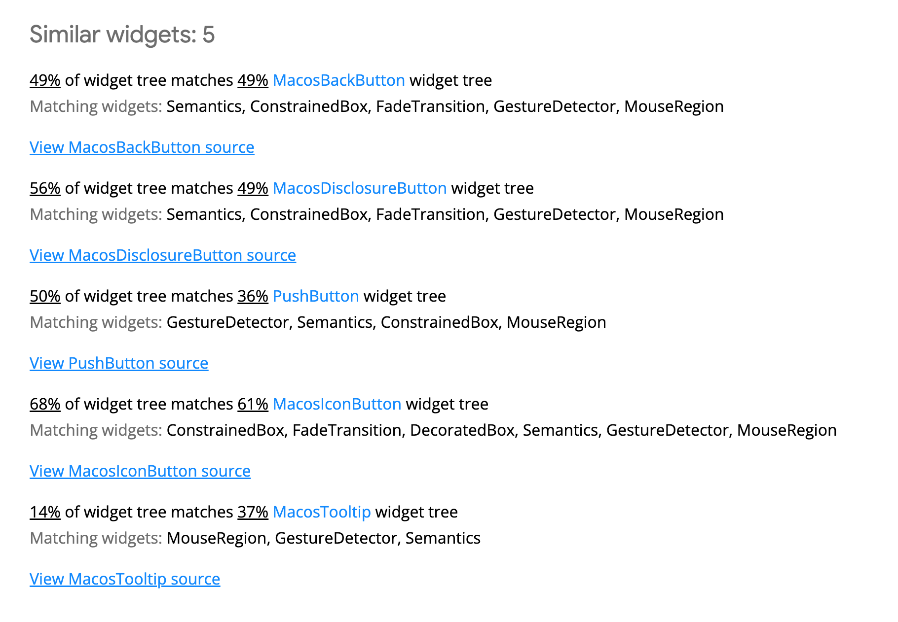
Think of it as a health check for your widget architecture. Previews let you iterate fast. DCM lets you iterate sustainably.
# Basic widget quality report
dcm analyze-widgets lib

# Find similar UI that should be refactored (disabled by default)
dcm analyze-widgets lib --show-similarity --reporter=html --open
The similarity detection is particularly powerful for design systems. It highlights widgets with matching build method structures, complete with visual diffs of the duplicated subtrees. This surfaces refactoring opportunities you'd otherwise miss.
Watch our DCM Analyze Widget video to learn more!
When Widget Previewer Becomes Your Competitive Advantage
If you're building a design system or component library, Widget Previewer isn't just a nice-to-have—it's essential infrastructure.
Without it, your design system exists as abstract documentation and scattered code examples. With it, every component is living, interactive documentation. Designers can see all variations. Other engineers can understand how to use components by seeing them in action. Edge cases reveal themselves.
This is what Storybook provides for web. This is what Jetpack Compose has built-in. Now Flutter engineers have it too.
Conclusion
Flutter's Hot Reload already changed the game. It made development fast. Widget Previewer completes the picture. It makes development focused.
Instead of compile-navigate-observe-repeat, you get instant isolation and instant feedback. Your component becomes the center of attention, not a small piece buried in your app's navigation hierarchy. And more importantly, can simply create your design systems decoupled from your business logic where it can run independently.
Your component library will be better. Your design system will be stronger. And your iteration cycle will finally feel modern.
Happy previewing.
Enjoying this article?
Subscribe to get our latest articles and product updates by email.